Revamping Digital Care: Enhancing the PulseLife Coach Experience
We partnered with one of the world’s largest generic pharma companies to design an all-in-one tool for their PulseLife program under CDH. It streamlined daily workflows for coaches, reduced app switching, and cut time spent on treating post-ACS and cardiovascular patients and on documentation.
Industry
Healthcare
Client
Pharma company
My role
UI/UX designer
Timeline
Nov'22 - Dec'22

Problem
PulseLife Coaches on CDH's platform connect with patients monthly for health updates and nutrition suggestions. However, the existing mobile app was ineffective due to its small screen size, complicating daily tasks.
Coaches also used multiple apps to manage work—scheduling meetings, taking notes, sharing diet plans, and tracking vitals across various tools, leading to a fragmented workflow and reduced efficiency. CDH decided to revamp the experience by creating a more efficient web app.
Backstory
This healthcare giant is one of the largest global generic pharmaceutical companies, specializing in heart-related medications. Their digital health subsidiary, CDH, offers digital therapeutic solutions, including the PulseLife program for heart attack and cardiovascular patients.
We were tasked with designing a product for PulseLife Coaches, part of CDH's ecosystem, which also includes solutions for patients, patient onboarding, doctors, alerts, and care managers.
Our approach
Discovery
We were called onsite in Mumbai, where we began with intensive stakeholder interviews to gain deeper insights into the problem and the client. We prepared a questionnaire aimed at understanding the objectives and challenges identified by stakeholders
Research and Results
Following stakeholder interviews, we established the research objectives, drafted a hypothesis to be validated during user interviews, and created a questionnaire. We then conducted user interviews with diet coaches.
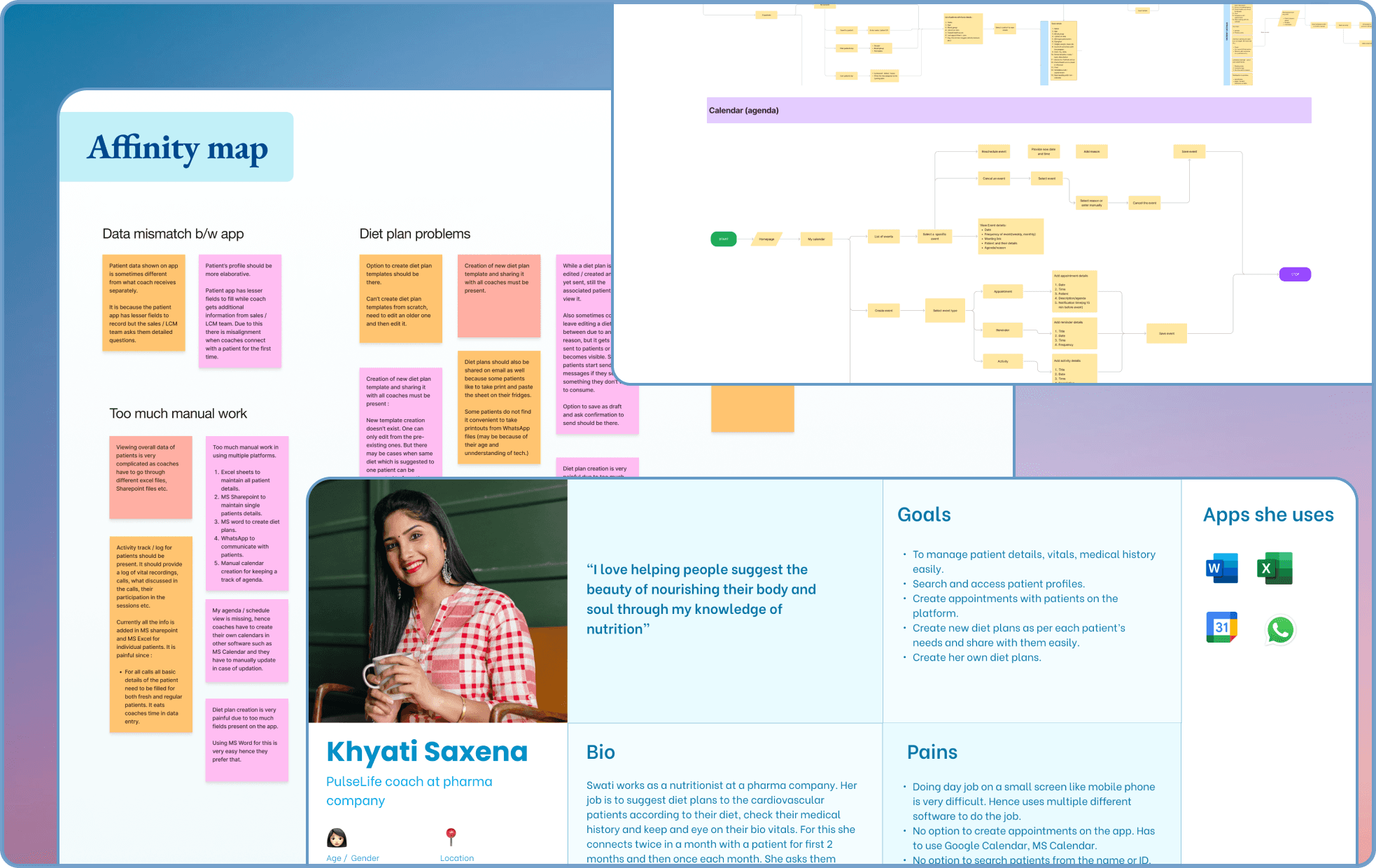
Defining the problem statement
After completing the user research, we developed a persona board and synthesized the results using affinity mapping, which helped us identify key pain points. Based on these insights, we drafted problem statements and conducted a brainstorming session to propose solutions for each one.
User flows and IA
Next, we needed to validate or refine the proposed solution. To do this, we began by structuring and organizing our product based on our research, creating an information architecture. We then identified key tasks like accessing Calendar, List of patients, Patient activity and Diet plans from our research and developed user flows accordingly.
Design
We created wireframes and a working prototype on basis of the user flows then validated those with the stakeholders and users.
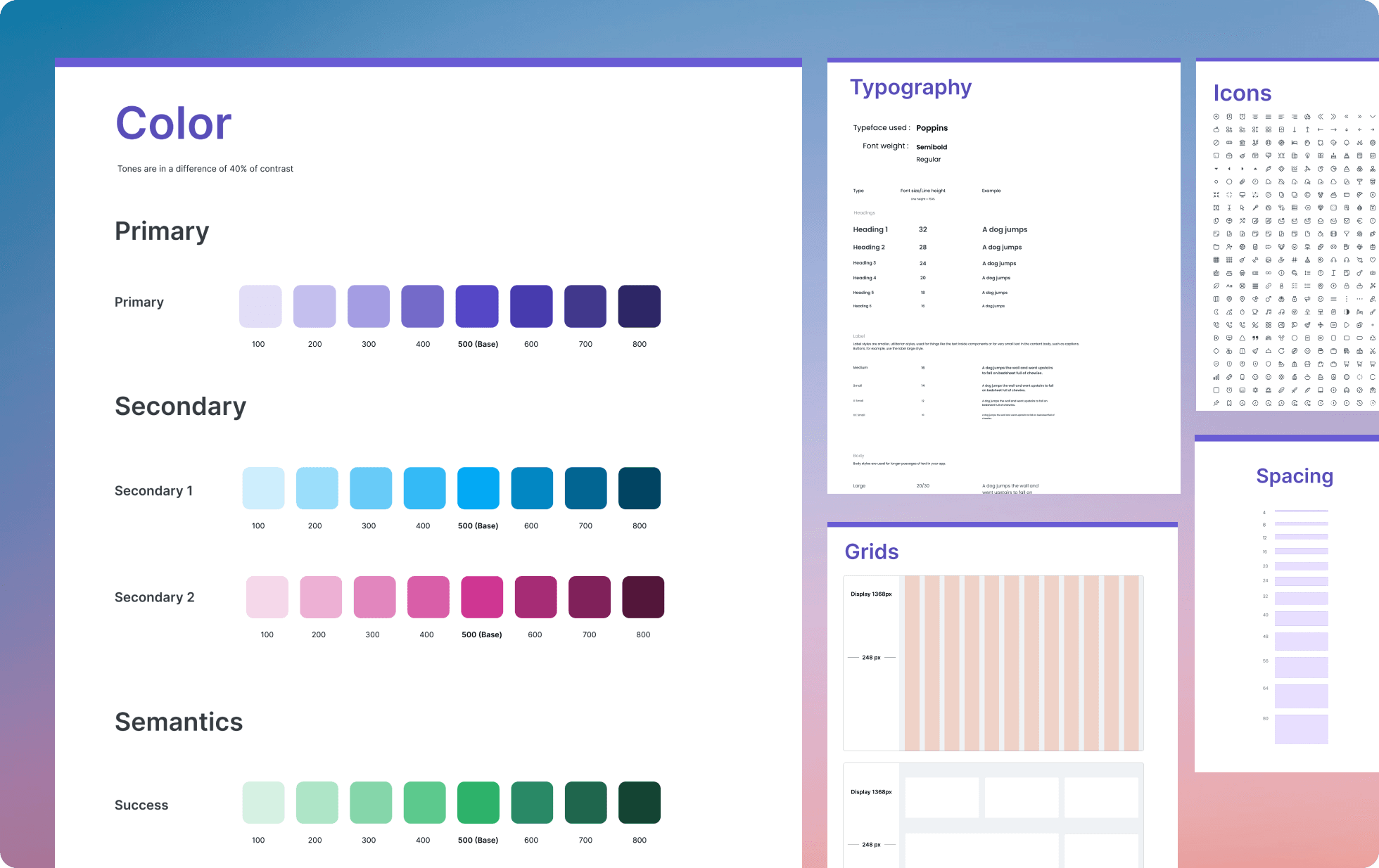
Followed by this, we created a design guide which consists of Typography, Colors, Spacings, Icons and a component library.
Then we started with visual designs for the flows we created.
Usability testing
Following the visual design phase, we conducted usability testing using a clickable prototype, based on predefined objectives such as task completion rate, time-on-task, error rate, and satisfaction score. We assigned a set of tasks to users and asked them to rate their experience, providing us with a satisfaction score.
Based on user feedback, we refined the designs, ultimately improving the satisfaction score from 7.5/10 to 9/10.
Conclusion
Key takeaways
Delivering an end-to-end design product under strict deadline and constraints.
Learnt to define colors, color palette, color usage in a design guide
Collaborating with Project Managers , stakeholders and developers
Understanding user behaviour and iterating on feedbacks
Learnt prioritizing features and tasks from PMs.
Results and impact
Usability improved by 20%, and diet coaches preferred the web app over the mobile app as it addressed their need to manage multiple platforms efficiently.


